
NeuroCircle: An Alternative EEG Signal Visualization
The field of neuroscience is becoming more important everyday as our interst in inner workings of our own brains and cognition grows exponentially each day. The words ‘neuro’ and ‘cognitive’ are also becoming buzz words too, being added to words back and forth.
One of the tools that plays a crucial role in this neuroscientific expansion is EEG(Electro encephelo gram), where brain signals are recorded transcranially with electrodes. These recordings are of course coarse averages of all signals in a specific brain region and dont give us the full picture, but combined with other powerful tools such as fMRI and deep brain electrodes, they play an important role in neuroscientific research.
A standard EEG signal series may look like this:
The figure above shows three different samples. It is obvious that they are different and blue and orange samples are possibly resultant of some underlying phenomena, but overall the series data is not very informative to an untrained eye such as myself. To derive information from these signals multiple methods are used to extract features[1], and classify signals[2]. These methods provide valuable information and help derive useful conclusions from the EEG measurements in compact numerical representations.
But since us humans are highly dependent on our visual perception, I wante to create a more visually stimulating representation of signal properties. After attending a talk by Refik Anadol about utilizing data and algorithms as a tool to create visual and auditory media and seeing his Melting Memories installation, I decided to implement an alternative visualization method for EEG signals. I used Python to extract various signal statistics and used these statistics in Processing as parameters determining the shape and motion of the figure.
The resulting figure looks something like this:
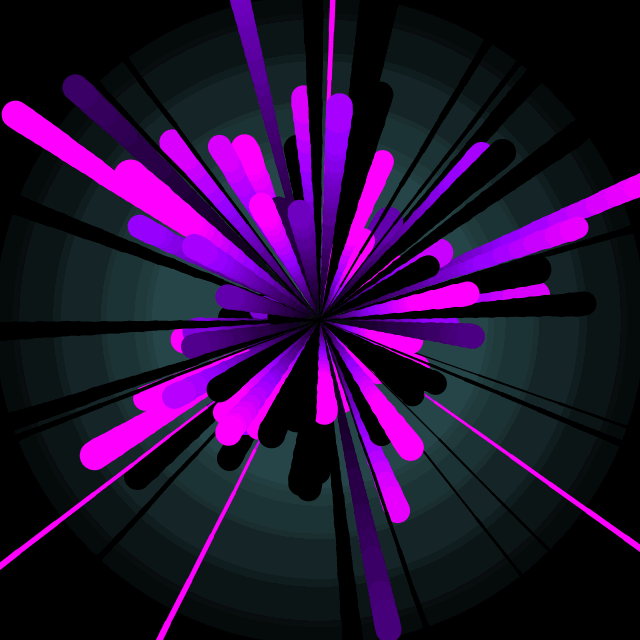
Each branch in the figure represents a seperate EEG measurement. The locations of branches are currently homogenously dispersed in a circle but can be changed to convey another information derived from the analysis. Since the figure has a circular form, the visualization method is aptly called NeuroCircle
For this current example I decided to use mean, standart deviation, kurtosis and the periodicity - which is simply the signal convolved with itself - of the signal to determine the properties of the figure, specifically:
- Mean -> The color change coefficient of branches
- Standart Deviation -> The movement speed coefficient of branch points
- Periodicity -> Length of branches
- Kurtosis -> Thickness coefficient of the branches
A Python script calculates the statistics for each EEG sample and Proceesing uses these statistics to initialize branches.
The EEG signals that were shown as time-series look like this:
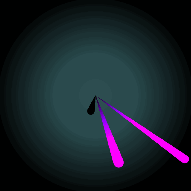
The long branches being the blue and orange smaples, respectively.
The EEG signals used for this implementation was acquired from here, which has 100 normal and epileptic EEG recordings. At this point this was more of an aesthetic driven project and the stats to be used as parameters were chosen randomly, and more specifically ease of implementation, but can easily be tweaked to be to include different statistics based on area specific details of the measurements.
1 - A. Al-Fahoum and A. Al-Fraihat, “Methods of EEG Signal Features Extraction Using Linear Analysis in Frequency and Time-Frequency Domains”, ISRN Neuroscience, vol. 2014, pp. 1-7, 2014.
2 - T. Felzer and B. Freisleben, “Analyzing EEG signals using the probability estimating guarded neural classifier”, IEEE Transactions on Neural Systems and Rehabilitation Engineering, vol. 11, no. 4, pp. 361-371, 2003.